The Algeco Logo, a monument of our industrial heritage
After the birth of Algeco, the evolution of modular and emblematic products of the brand, Algeco France approaches the company logotype. It's simple: it's almost "intangible"! Yes, since its creation, the major visual identity of the brand has changed only slightly. Here are the explanations of Jérémie Fesson, co-founder of Graphéine, a brand identity advisory agency and Creative Director at the Paris office.
Where do the inspirations for the Algeco logotype come from?
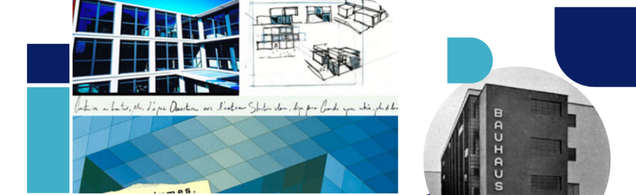
The Algeco logo is the direct heir to the universalist geometric aesthetic of the Bauhaus, the famous German school of architecture and applied arts, founded by Walter Gropius in 1919. His style is minimalist because "form must follow function". The Bauhaus taught to democratize design to place it at the center of everyday life to make it simpler, clearer. His students also relied on new industrial production methods for mass production.
"The modular, timeless aesthetic of the Bauhaus" (© Illustrations : Graphéine)
The Algeco logo is above all a drawing... intentionally! His style fits closely with the avant-garde and rationalist typographic research of Herbert Bayer and Paul Renner through his "Futura" typography. The shape of the alphabet is sifted through a methodical construction grid in which each letter is obtained by arranging the shape of bases such as circle and rectangle. Therefore, the logo is heavily imbued with an innovative and even "graphically revolutionary" mindset at the time.
What are the strengths of the Algeco logo?
It is a typographic block whose inscription style evokes Algeco's flagship product: the prefabricated 15 m module2. Elementary and basic like a Lego brick, it induces the idea of games, construction and customization.
In addition, obviously, this logo, unlike any other, conveys a decided, personalized modular identity, precisely constructed from several simple geometric shapes. They are combined in such a way as to recreate all the letters of the brand name. And in solid blocks, each letter represents an Algeco module. This gives a "raw", but at the same time "playful" and "agile" aesthetic.
"Highlighting the modular character of the Algeco logo. By breaking down the vocabulary of letter shapes, we discover that the letter C is the basic module for drawing each letter." © (Illustrations : Graphéine)
This custom character belongs only to Algeco. He retranscribes his values to the letter, and that immediately. Where Nike uses its "Swoosh" emblem to complement its brand message, Algeco says it all by "simple" formatting its name.
A good logo is above all a form that lasts over time. It is also distinguished by a distinctive aesthetic.
"The modular typographic style has a big comeback with the logo of the next Hollywood adaptation of Frank Herbert's science fiction novel "Dune" (written in 1965). The logo uses a close basic module in a "light" version. Note that NASA's famous 'worm' logo also has a quasi-modular structure that gives it an experimental and futuristic style." ©
In this sense, we are currently witnessing a "renaissance" of logotypes designed in the 70s. They temporarily disappeared in the 2010s as digital profoundly transformed the economy and consumer habits. This phenomenon has only recently amplified after a wave of "Blanding" (for "sanitized branding") in which many brands seemed to lose their soul by changing the bold historical logotype to a uniform typographic style and "sans serif".
Interchangeable and neutral, this has been the logo since the early 2020s. It seems that today many brands are revising their copy and returning to identities that correspond to a certain "golden age" associated with the 70s. Returning to a period synonymous with prosperity for an anxious new generation struggling to project itself into the future with ecological and pandemic danger: nothing more natural!
So Algeco has become more than just a name, thanks in part to its logo?
Exactly! Like "Kleenex" or "Frigidaire", the Algeco brand is mistakenly used as a common name for a modular construction in popular vocabulary. It is not uncommon to hear an "Algeco" said – which should be absolutely banned since Algeco is a registered trademark – when it comes to a competing brand.
The perpetuation of the Algeco logo also improves the history of the company and protects the timelessness of the brand. Reebok, Kodak, NASA and, more recently, Burger King have prompted the reappearance of a "refreshed" version of the 70s version of their logo. This demonstrates that the logo is a formidable heritage of the brand, capable of lasting through the ages if products and services "follow" it. It also demonstrates that there is a risk of blindly wanting to succumb to fashion mermaids, especially when there is already strong notoriety and therefore a strong emotional connection between a logo and its audience. The logo can be an object of inestimable value that deserves to be treated with the utmost respect, in the absence of breaking a relationship.
Algeco, an iconic logo
This is the case of the Algeco logo, certainly iconic, recognizable at first glance. It's also a soothing daily reference point. Its impactful, futuristic and uncompromising design evokes a powerful imagination in tune with the concerns of our increasingly mobile and connected lifestyle. It also approaches the dress and graphic codes of a globalized urban culture, and we can reasonably think that it will become a symbol of "street credibility" for the new generation.
Yes, the Algeco logo is much more than a graphic object: it is a monument of our industrial heritage.
Thanks to Jérémie Fesson for his refined analysis of this logo of which we are so proud. Take the opportunity to discover Graphéine, an agency also unlike any other, at the forefront of brand identity.